

Looking for gallery wall ideas? To many of us, gallery walls — those sections hung with multiple pieces of art, like in a museum — feel like next-level design: big-impact projects with seriously big difficulty ratings. Way more complicated than hanging a single painting, they require a good eye — and lots of hammering.
But truth be told, there’s no reason your average homeowner can’t knock out a great-looking gallery wall. Good decor is both art and science, and while there’s plenty to be said for a sense of style, give even more credit to careful planning. Even if your eye for design seems to be colour-blind, there’s still hope.
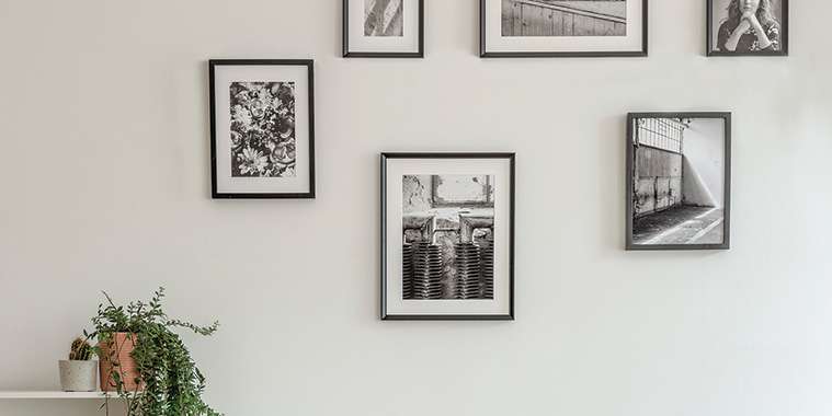
• Stick to symmetry
When you’re starting to plan your gallery wall, think from the center. Start groupings with the largest pieces — perhaps one large piece, or a large, matching set — to create one big focal point. Once you’ve selected your showstopper, place it in the exact center of the wall, at eye level.
Yes, eye level. Think about where you’d usually be viewing the wall from. Is it a small room? Aim for about 60 inches from the floor to the center of your gallery wall. In a bigger room with a tall ceiling, take advantage of the extra space — you’ll be viewing the wall from farther away, pushing eye level higher.
Once you’ve determined your centerpiece, build around it symmetrically, adding similarly shaped pieces on the right, then the left; the top, then the bottom.
That’s the biggest secret. Keep it symmetrical, and you don’t get overwhelmed. Bonus: You’re also less likely to run out of space. If you build out your gallery wall starting with just one side, you run the risk of hitting a curtain or a window on the opposite side, making the final product look cramped and poorly designed.
• Think trees
Your gallery wall’s highest point should be in the dead center, descending downward on either side. Need inspiration? Look at nature, whether a pine tree or a mountain.
Everything spreads out. It’s a pleasing and subtle thing, and it works well when arranging groupings.
It’s important to note that you don’t want the top piece in the gallery wall to be significantly higher than the rest — you’re just looking for an understated, geometric effect.
• Use the floor as a staging ground
You don’t have to create your gallery wall on the wall itself — and if you’re a novice designer, you might find yourself with a dozen accidental holes as you arrange and rearrange. And rearrange.
Instead, we recommend clearing out space on your floor for arrangement. Make sure it’s the exact size and shape of your empty wall (use masking tape to mark it off), and start planning from the center, just like you would on the wall.
Don’t have space on the floor? You can also cut out the dimensions of each piece from craft paper and “hang” them on the wall with tape. Voilà: easy re-arrangement, no nails needed.
• Don’t line up the edges
Here’s a cardinal rule: Do not ever (ever!) line up the tops, bottoms, or edges of your frames — with each other or with any straight edges in your home’s architecture, like windows, doorways, or molding. A gallery wall is much duller if everything is perfectly lined up, which creates unintentional edges that can distract the eye.
It’s much more visually interesting, compositionwise, to vary the heights of two adjacent pieces.
The only caveat: If you have a matching set of artworks, it is acceptable to line them up — either two by two or several in a row.
• Add trinkets
Don’t restrict yourself to photography and paintings — anything can go on a gallery wall, from monogrammed letters to clocks to instruments. What represents you?
A grouping should reflect the owner’s interest, and their lifetime collecting art or trinkets in their travels. What makes a collection unique is that it’s specific to you.
Are you a musician? Try a piece of antique sheet music, scrawled with notes from the composer. Add in a bracket or wall shelf, filled with decorative items from the silly (model cars) to the serious (vases) — or whatever strikes your fancy.
But keep in mind the golden rule of symmetry when integrating oddly shaped pieces into your gallery wall puzzle: What will even it out on the other side? It doesn’t have to be an identical item, but look for something that has roughly the same size or heft.
• Pick good frames (but they don’t have to match)
Over your lifetime, chances are good you’ve amassed a mishmash of frames, from wood to silver to gold. Don’t worry about keeping like with like on your gallery wall. Yes, it can look great to have all-matching frames, but it’s not necessarily better. In fact, a collection of different materials can look far more interesting.
It’s unlikely everything will be framed exactly the same way, and you can’t go out and snap your fingers and make that happen. Mix those frames. They don’t have to be all the same.
But if you have a cheap frame, it will stand out, so consider getting it reframed.
“You don’t want to mix a junky old frame with a plastic film next to a nicely carved and gilded museum frame,” Smith says.
That goes for easel-backed frames — the ones that are intended to stand up on a surface. While they might have attachments for hanging, they never stay straight. Those things are really not suited for hanging on the wall.
If you insist on hanging them, he recommends removing the easel first.
• Be odd
If you’ve got an even number of pieces, take one away or add, because the best gallery walls come in odd numbers.
You always end up with one left over or an empty space, and you can’t come out with a pleasing grouping. Odd numbers make better groupings.
This all comes back to symmetry: If you’re starting with a large piece in the middle then building outward, one side at a time, you’ll never reach symmetry with even numbers — so don’t be afraid to purge or buy.
— Realtor.com