

Colour has the power to transform a space, and as we start the new year, it’s time to explore the colours that will inject some personality into your humble abode. We’re not just talking about your run-of-the-mill beige or off-white; 2024 has big plans for timeless soft black, relaxed sky blue, and energetic terracotta. This year’s colours of the year are anything but mundane.
Here are the 2024 colours of the year from some of the top paint and design companies.
Pantone: Peach Fuzz
Pantone’s highly anticipated colour of the year is Peach Fuzz, which the company says “captures our desire to nurture ourselves and others. It’s a velvety, gentle peach tone whose all-embracing spirit enriches mind, body and soul.”
“In seeking a hue that echoes our innate yearning for closeness and connection, we chose a colour radiant with warmth and modern elegance,” shares Leatrice Eiseman, Executive Director, Pantone Color Institute™. “A shade that resonates with compassion, offers a tactile embrace, and effortlessly bridges the youthful with the timeless.”
So how can you incorporate Peach Fuzz into your home? Aside from the obvious choice of painting a room or accent wall, you can look to add Peach Fuzz through smaller, more flexible elements in your space. Pantone partnered up with Ruggable and Spoonflower to provide Peach Fuzz rugs, door mats, bath mats, wallpaper, fabric, and other home décor items that give you the chance to bring the Pantone Colour of the Year into your home in 2024.
Benjamin Moore: Blue Nova
Benjamin Moore’s Blue Nova captures the spotlight with its endlessly classic appeal. Inspired by exploration, this galaxy-esque blue seamlessly blends modern and traditional styles.
“Blue Nova CC-860 is an alluring mid-tone that balances depth and intrigue with classic appeal and reassurance,” says Andrea Magno, Colour Marketing and Development Director at Benjamin Moore.
Want to make a bold statement? Consider painting an accent wall in a living room, creating a celestial focal point that sparks conversation. Elevate your dining experience by using Blue Nova on the ceiling, or incorporate this rich, grounded blue into furniture pieces or artwork in a home office.
Pair this blue-violet hue with dynamic colours like orange. Try Topaz 070 from Benjamin Moore’s 2024 Colour Trend palette. Whether subtly applied or boldly embraced, Blue Nova offers a vibe that’s truly out of this world.
Behr: Cracked Pepper
Step into the bold and delicious world of Cracked Pepper, Behr’s Colour of the Year for 2024. This versatile soft black is a timeless choice that melds seamlessly into any design style, bringing an elevated and sophisticated look to your home.
“From heightening the aromas of a dining room to feeling the softness of a living area, Cracked Pepper enhances the natural expression in any space,” says Erika Woelfel, Vice-President of Colour and Creative Services at Behr Paint Company.
For a dramatic and elegant look, use Cracked Pepper in a primary bedroom, creating an intimate and cozy atmosphere that’s perfect for relaxation. Take this colour to the heart of your home by painting kitchen cabinets — the dark allure pairs perfectly with both modern and traditional styles. If you’re feeling adventurous, extend this soft black to your exterior spaces, like your front door or shutters for bold curb appeal!
As dark tones gain popularity, Cracked Pepper is your ticket to a timeless, elevated and stylish home.
Sherwin-Williams: Upward
Imagine a sunny-day shade that infuses your space with positive energy and tranquillity — meet Upward by Sherwin-Williams. This breezy and blissful shade of blue with grey undertones embodies the essence of a carefree, sunny day, fostering harmony and
peaceful contentment.
“With this colour, we invite our consumers to take a pause and infuse a new sense of ease and possibility into their spaces — one that doesn’t overwhelm, but rather establishes meditation and tranquillity,” says Sue Wadden, director of colour marketing at Sherwin-Williams.
Upward effortlessly blends into various design styles, from modern farmhouse to grandmillennial. Transform your bathroom by using Upward on the wall behind the bathtub to create a spa-like ambiance. Introduce Upward as an accent colour in your kitchen by painting the island. Create a calm and inspiring play space for your little ones by using Upward on the walls of a playroom, providing an uplifting backdrop for creativity and play.
As the resurfaced popularity of coastal chic design influences our spaces, Upward invites you to refresh your interiors with a breath of crisp, revitalizing air.
Glidden: Limitless
Step into a new era of explosive creativity and change with Glidden’s Limitless. This fresh, warm hue is anything-but-yellow, offering the stamina of a primary colour and the versatility of a neutral.
“Consumers are using colour in even more unconventional ways than ever before and they need a palette that offers versatility to work with both new and existing decor,” says Ashley McCollum, PPG colour expert, Glidden brand. “Limitless understands the assignment and embodies this perfectly.”
As warm neutrals replace cool tones in 2024, Limitless emerges as a versatile custard hue that complements both warm and cool tones. Use it anywhere and everywhere — on kitchen cabinets, walls, ceilings, or even as a refreshing base for smaller areas. Embrace the glow-up as Limitless brings cheer, warmth, and a touch of vibrancy to your living spaces.
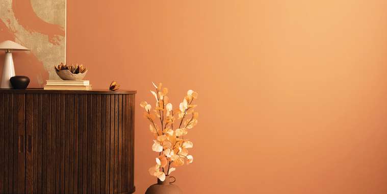
HGTV Home® by Sherwin-Williams: Persimmon
Soft terracotta tones take centre stage with Persimmon, HGTV Home® by Sherwin-Williams’s Colour of the Year for 2024.
“Persimmon balances the energy of tangerine with grounded neutral undertones, making it perfect for spaces like living rooms and kitchens as it promotes positive relationships and conversation,” says Ashley Banbury, Sherwin-Williams Colour Marketing Manager.
Use Persimmon to create a statement wall that adds warmth to your space or incorporate it into a coastal chic design style, which continues to gain popularity. Extend the sunny energy to your outdoor spaces. Persimmon is your go-to for infusing lightness, energy, and a touch of the unexpected into your home.
Whether you’re exploring the cosmic allure of Blue Nova, the sophisticated depths of Cracked Pepper, the serene tranquillity of Upward, the boundless warmth of Limitless, or the energizing charm of Persimmon, these colours offer you a palette of possibilities.
Here’s to a vibrant and colourful year ahead!
— REALTOR.ca