

Colour has such a huge impact in any design scheme. It often makes the difference between a nice space and a total WOW space. So why are so many people afraid of incorporating colour into their décor? Some clients are concerned about current colour trends, or the expense of keeping up with the latest in décor, while others are just terrified of adding colour at all. I’ve had clients say they really don’t like the current colours and do not want them in their homes at all. How do we find a welcome balance that allows you to incorporate colour while catering to the individual likes and dislikes of the client?
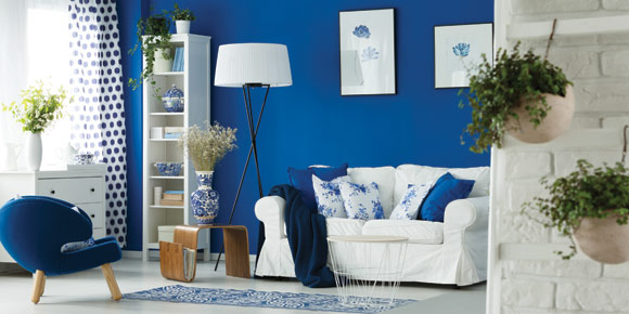
Colour trends are always changing. We see this in fashion as well as all aspects of design. It is a legitimate concern to date stamp a design by using the current colour trends. The Pantone Colour Institute announces the highly anticipated Colour of the Year in December. It is based on market trends from numerous industries and is voted on by an elite panel. Every year the colour of the year changes, sometimes quite dramatically! The colour for 2018 is Ultra Violet – Pantone 18-3838. You can often see these colours on the covers of fashion and décor magazines in the first few months of the year. It is also evident in home décor and fashion merchandise.
Use neutrals on main items
So how do we incorporate colours without having to redecorate every few years? One of the best solutions is to use neutrals for your main items – paint, flooring, large furniture pieces can all be in neutral shades that are easily used in multiple designs. Use accent pieces such as smaller inexpensive décor pieces or artwork that can be swapped out to create a new and different look. Smaller pieces are much less expensive and can have a huge impact in the overall look and feel of a design and space.
If possible rearranging the furniture placement in a space or swapping out a few smaller on trend colour furniture pieces is a wonderful way to stay current on a budget!
We just returned from New Orleans and I was pleasantly surprised at the unique historical blends in their architecture. The French and Spanish influence was clearly evident however, there is a definite Caribbean influence in the colours all around you! They have specific guidelines in many neighbourhoods for the exterior colours of homes. Bright colours abound in this beautiful city! The colours are a beautiful explosion before your eyes stimulating your senses and helping you fall in love with the unique sights! More importantly – the colours all WORK together! It adds to the charm and energy that is uniquely New Orleans. We can learn from this if we let go of our conservative nature and allow ourselves to be uniquely ourselves! Colour should be embraced and celebrated!
“Feel good” colour schemes
One of the things I’ve observed over many years in the design industry is that people gravitate towards certain colours schemes. I call this their “feel good” colour palette. If you walk through their homes, you can see the same colours repeating again and again. It is completely subconscious. Clients are surprised when I point this out to them. Colour is one of the things that plays on our emotions. Some colours may stimulate us, others may calm us while others may create a cozy, welcoming feeling. However, it is critical to learn which colours mean what to you!
Everyone responds to the colours differently. Red is typically a high energy colour. However, if it is your favorite colour and makes you feel good – use it! You want to surround yourself with the colours that make you feel good! You will be less likely to feel the need to redecorate as often when you are surrounded by colours that make you feel good.
Most clients we work with are more interested in creating a lasting design that they love than changing the colours to blend with current trends. So give in to your wild side. Find out the colours that make you feel good and embrace them. The more you surround yourself with feel good things the happier you will be in your space!
Go with what makes you happy
The best advice I give my clients is find what makes you happy and go with it! If you’re working with a limited budget, start small and shop where your budget allows. Get creative if necessary and repaint repurposed items to give you a unique and fun look.
As your budget grows over the years you can add some beautiful artwork, accent furniture and beautiful décor pieces. One of my favorite monthly design activities is to curl up with my coffee and my Style at Home Magazine. They have a section called High – Low. The same room designed with almost identical materials – the look is indistinguishable. However, the budget is a massive difference often 25% less than the high side at full designer prices with premium name brands. I love how we can be so creative and design on a budget!
Design is one of the few industries where we can create a high end look on a shoestring budget! Go out there and find what makes you happy, embrace colour, and be as creative as you want to be to achieve the look that is uniquely yours! Take the time to enjoy the process as much as the final result! Happy Decorating!