

By Lisa Kahn
The kitchen is the heart of the household, a place where you prepare meals and make memories. So it only makes sense that your kitchen’s colour scheme reflects your unique tastes and personality, right?
The answer to that is yes — and no.
Although there may be a special hue that gets your heart thumping, there are many reasons why it makes sense to opt for a neutral palette in your kitchen. Many design professionals agree that using shades like white, beige, or gray as the foundation for your kitchen not only open up a spectrum of colourful possibilities, but enhance the value of your home.
The Never-Regret Factor
“Timeless colours are perfect, whether for resale or for your dream home,” says Jackie Jordan, director of colour marketing for Sherwin-Williams. “Your kitchen won’t suffer from this-looks-like-it-was-done-in-the-90s comments if you opt for a neutral palette.”
“It’s a space where potential buyers envision themselves spending a lot of time,” agrees Sue Pelley, spokesperson for Decorating Den Interiors. Thus, although you may believe your purple cabinets are divine, others may think they’re dreadful. And that, she says, can be a real barrier to a sale.
The Versatility of Neutrals
But does going soft and natural mean you have to stifle your inner Van Gogh? Not a chance.
“A neutral kitchen is the perfect canvas to personalize as your tastes change,” says Jordan. “It gives you the opportunity to accessorize with fun rugs, dinnerware — even just a fresh vase of flowers to liven things up.”
“I love being able to change moods with colours, often inspired by the changing seasons,” says Wendy F. Johnson, a certified kitchen and bath designer. “Neutrals can provide the base for a huge range of related or contrasting colours to be used with them, from bright and saturated to peaceful, muted hues.”
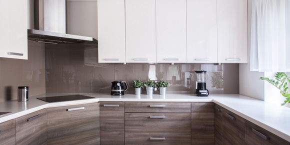
Texture also adds enormous impact to a neutral kitchen. A combination of materials from rough to smooth and matte to high gloss creates visual contrast and reflects light differently throughout the day, says Johnson. “For example, you can mix barn wood walls and satin painted drywall, white oak cabinetry with glass insets, lustrous concrete countertops with a stone tile backsplash. These might all be in the same tones, but there is nothing boring here.”
Using Colour to Complement Your Kitchen's Size
Your kitchen’s square footage is another important factor to consider when choosing a colour palette. If the space is small, opt for paler hues for cabinets, walls, and countertops. Shades of white, bone, or cream reflect light and help a tiny kitchen feel brighter and more spacious.
Neutrals are also a great choice for kitchens that open up to other rooms, notes Pelley. “If your kitchen is part of a great room design, remember that any new paint will need to work with the colour schemes in those rooms, too.”
Non-Permanent Ways to Add Pops of Colour
Rather than committing to a single colour scheme, a neutral kitchen lets you sample the rainbow. One option is to choose coordinating window treatments and chair cushions to liven up the space, says Johnson. An eye-catching poster, multihued area rug, or a collection of pottery displayed on a shelf all add personality to your kitchen and are easy to change when you’re ready for something new.
Paint is another low-cost way to incorporate a pop or two of colour into a neutral room. You can grab a brush and paint your kitchen chairs or counter stools, or add a bright hue to the interior of a glass cabinet. Ready for something bigger? Consider rolling a bold shade on a single wall to create lively contrast in an otherwise single-colour space.
Top Neutral Colour Schemes
Neutrals may be timeless, but there are some combinations that look especially fresh. “I love warm grays and whites — always have,” says Johnson. “There are so many natural materials available in these tones that mix together beautifully, and all colours look gorgeous against this type of palette.”
Some designers favor white and light grays in a kitchen. It’s a sleek and modern combination that works perfectly with the ever-popular stainless steel appliances and subway tile.
When it comes to a big-ticket item like a kitchen, it makes sense to choose a palette that will endure for the long term, says Johnson. “Those of us who thrive in colourful surroundings will groan at this, but even we need some soft, peaceful environments sometimes.”
— houselogic.com